The brief
A new hotel group with a national network in its plan and not a single property open yet. Everything had to be decided before anything was seen: how a parent, its hotel brands, and every future site would relate to each other, what the guest would feel in the first thirty seconds, and how a name could compound in value with each opening rather than dilute. We started with a market audit of forty-five properties across Auckland's hospital catchments and worked from there.
The thinking
One word sits at the centre of the company, and it is the guest's word before it is ours. ME. Every name in the house begins with it, and every layer beneath serves it. That is not a naming convention, it is the philosophy, spelled.
The audit gave us the visual territory. Navy held 88 percent of the competitive set and black 60 percent, while the warm, natural register sat almost untouched. The market handed the brand an ownable look, and the strategy claimed it. The design philosophy followed: make a homely experience out of a clinical category. Warm over sterile. Handmade over machined. Quiet over loud.
The work
Brand architecture across five layers, from the group that guests never see through to the property compounds that personalise the mark with their place. A naming system built so every name names the experience. Three customer journeys mapped by circumstance rather than demographic, and designed around five behavioural truths about how people feel in the in-between.
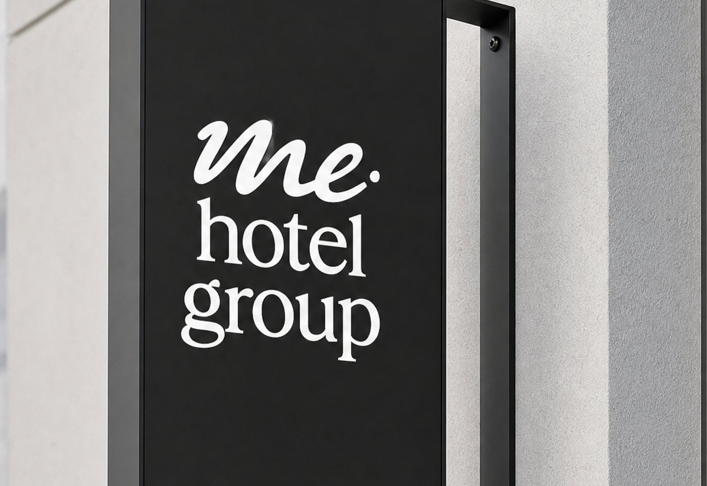
Then the identity: a handwritten lowercase wordmark with its full lockup family, a letter mark, a script device, a fern, a pattern, and a six-colour palette from Ink and Deep Canopy through Warm White and Burnished Gold. A master internal brand document that works at every altitude, investor to operator, and a brand book with rules on clear space, minimum size, and use.